An experimental clone of the new iOS 11 App Store app
appstore-clone
An experimental clone of the new iOS 11 App Store app for this Medium Article
Description
Apple announced an entirely redesigned iOS App Store experience at WWDC 2017. It placed an increased focus on rich, in-depth, long form content over the previous interface. I wrote about the significance of the redesign, and my first impressions.
I decided to spend some spare time diving a little deeper into the User Interface of the new App Store itself in order to gain a deeper understanding of how it works and in some ways how I might put my own subtle, unique improvements on it if I’d had the chance.
What was initially just a late Friday night, nothing-better-to-do project recreating the Today view cards, ended up snowballing into an incredibly fun weekend-long passion project that I really enjoyed spending time on.
Features
Collection View
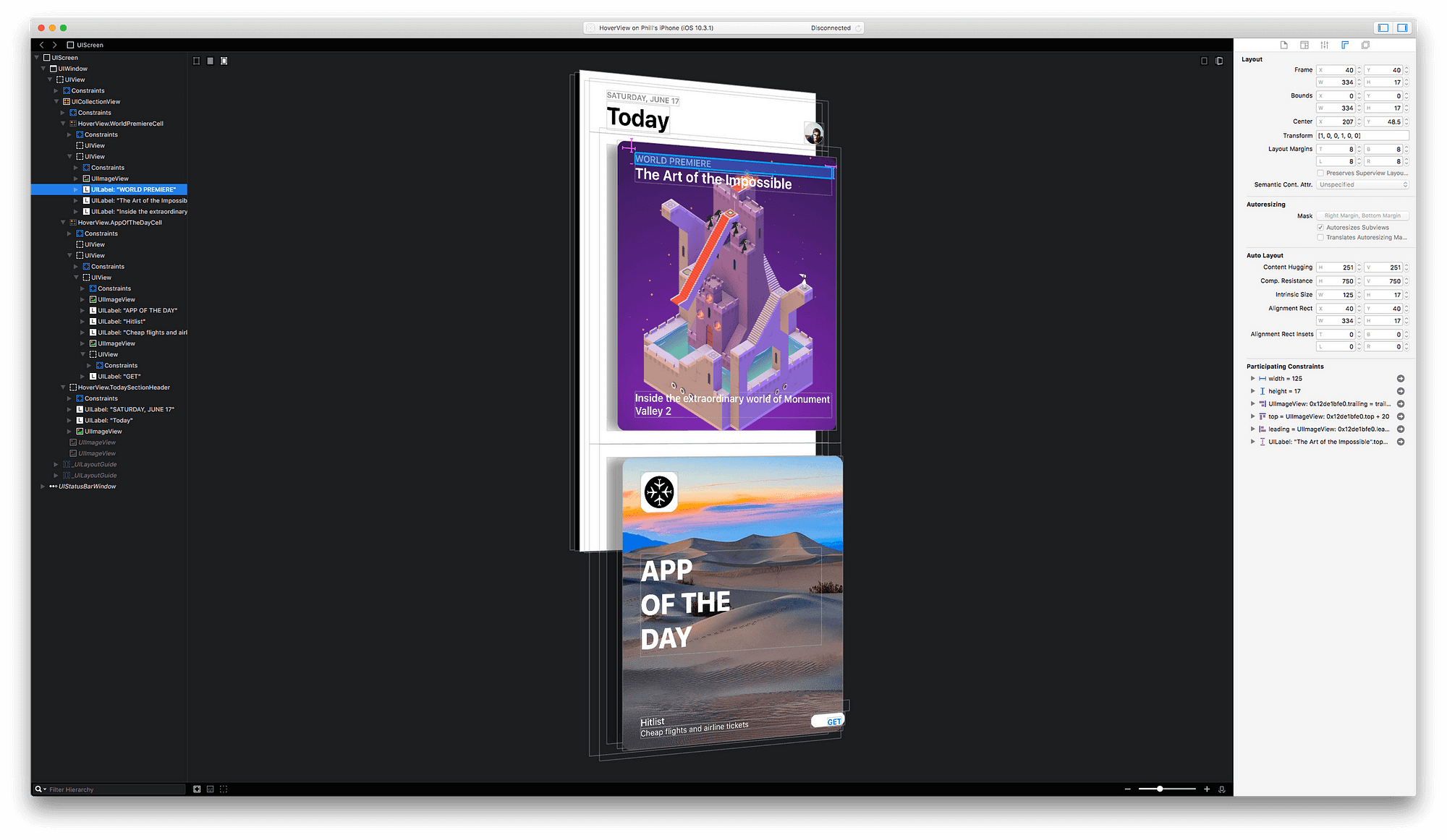
Today View is actually quite a simple interface, it’s obviously just a UICollectionView, and each card is a UICollectionViewCell. In order to duplicate these cards, I created a base UICollectionViewCell subclass called BaseRoundedCardCell that all card cells inherit to gain all of the underlying features that each card has, including the shadow.
Shadow
Each Card in the App Store app has a soft shadow, with a slight vertical offset which gives it a sense of depth and suggests to the user that they can tap on a card, to open its detailed story view. In the current App Store app this shadow seems to be just a static shadow. I decided not just to clone this shadow, but go even further using Core Motion to move the shadow based on the Pitch (Horizontal tilt) and Roll (Vertical tilt) of the device. In a subtle way this would make the interface feel more lively and rich, similar to the way that it does on the tvOS interface.
// Roll/Pitch Dynamic Shadow
if motionManager.isDeviceMotionAvailable {
    motionManager.deviceMotionUpdateInterval = 0.02
    motionManager.startDeviceMotionUpdates(to: .main, withHandler: { (motion, error) in
        if let motion = motion {
            let pitch = motion.attitude.pitch * 10 // x-axis
            let roll = motion.attitude.roll * 10 // y-axis
            self.applyShadow(width: CGFloat(roll), height: CGFloat(pitch))
        }
    })
}
Long Press Gesture
On the current App Store app each Card view itself is also fixed and not overly interactive. You can tap on a card to transition into the Story detail view but you can’t interact with a card in any other way. Just like I can with the tvOS interface, as a user I’m compelled to touch and manipulate cards a bit more than just a tap. I went ahead and improved on this by implementing a long press gesture that shrinks the card slightly when it is held down. This extends the depth metaphor that the shadow creates but is also not too excessive so as to make cards feel too flexible and unrealistic.
// MARK: - Gesture Recognizer
private func configureGestureRecognizer() {
    // Long Press Gesture Recognizer
    longPressGestureRecognizer = UILongPressGestureRecognizer(target: self, action: #selector(handleLongPressGesture(gestureRecognizer:)))
    longPressGestureRecognizer?.minimumPressDuration = 0.1
    addGestureRecognizer(longPressGestureRecognizer!)
}

internal func handleLongPressGesture(gestureRecognizer: UILongPressGestureRecognizer) {
    if gestureRecognizer.state == .began {
        handleLongPressBegan()
    } else if gestureRecognizer.state == .ended || gestureRecognizer.state == .cancelled {
        handleLongPressEnded()
    }
}

private func handleLongPressBegan() {
    guard !isPressed else {
        return
    }

    isPressed = true
    UIView.animate(withDuration: 0.5,
                   delay: 0.0,
                   usingSpringWithDamping: 0.8,
                   initialSpringVelocity: 0.2,
                   options: .beginFromCurrentState,
                   animations: {
                       self.transform = CGAffineTransform(scaleX: 0.95, y: 0.95)
                   }, completion: nil)
}

private func handleLongPressEnded() {
    guard isPressed else {
        return
    }

    UIView.animate(withDuration: 0.5,
                   delay: 0.0,
                   usingSpringWithDamping: 0.4,
                   initialSpringVelocity: 0.2,
                   options: .beginFromCurrentState,
                   animations: {
                       self.transform = CGAffineTransform.identity
                   }) { (finished) in
        self.isPressed = false
    }
}
iPad Grid Layout
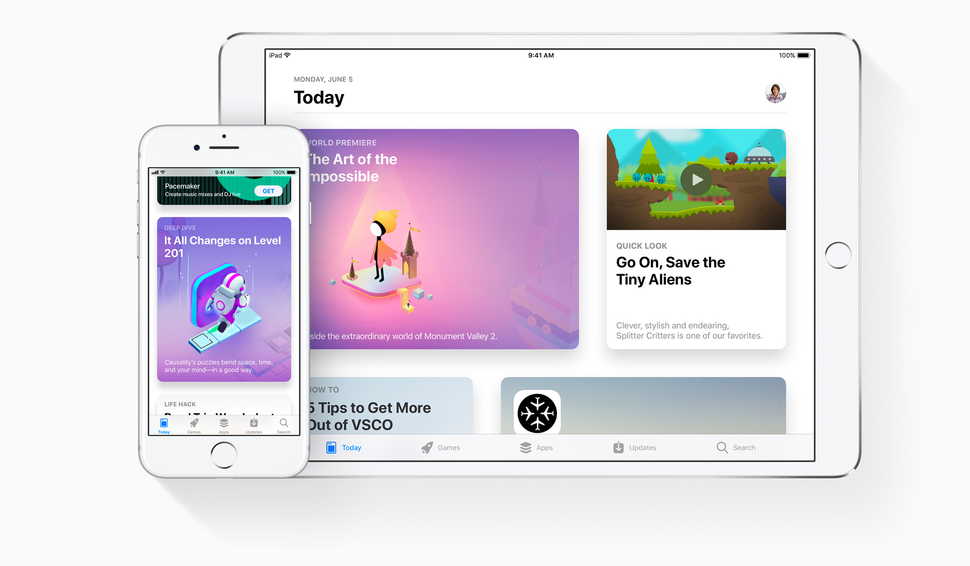
Depending on if you’re viewing the new App Store app on an iPad or an iPhone, the cards will layout differently. On an iPhone you’ll see one vertical column of cards all of the exact same width and height, while on an iPad you’ll see two columns of cells and each cell will alternate between compressed width and expanded width, to provide more of a grid layout that makes better of use of the iPads larger screen real estate.
// MARK: - UICollectionViewDelegateFlowLayout
func collectionView(_ collectionView: UICollectionView, layout collectionViewLayout: UICollectionViewLayout, sizeForItemAt indexPath: IndexPath) -> CGSize {
    if UIDevice.current.userInterfaceIdiom == .phone {
        return CGSize(width: collectionView.bounds.width, height: BaseRoundedCardCell.cellHeight)
    } else {

        // Number of Items per Row
        let numberOfItemsInRow = 2

        // Current Row Number
        let rowNumber = indexPath.item/numberOfItemsInRow

        // Compressed With
        let compressedWidth = collectionView.bounds.width/3

        // Expanded Width
        let expandedWidth = (collectionView.bounds.width/3) * 2

        // Is Even Row
        let isEvenRow = rowNumber % 2 == 0

        // Is First Item in Row
        let isFirstItem = indexPath.item % numberOfItemsInRow != 0

        // Calculate Width
        var width: CGFloat = 0.0
        if isEvenRow {
            width = isFirstItem ? compressedWidth : expandedWidth
        } else {
            width = isFirstItem ? expandedWidth : compressedWidth
        }

        return CGSize(width: width, height: BaseRoundedCardCell.cellHeight)
    }
}
Section Headers
Since the Today view is a timeline style interface, cards need to be separated out into daily sections and marked by their dates. This allows the user to scroll down, through cards and catch up on the editorial content from previous days that they may have missed. While using the new App Store app I noticed that these headers are not sticky, but infact scroll along with the rest of the UICollectionViewCells, therefore they must be UICollectionReusableView’s used as Section Headers for representing each day.
func collectionView(_ collectionView: UICollectionView, layout collectionViewLayout: UICollectionViewLayout, referenceSizeForHeaderInSection section: Int) -> CGSize {
    return CGSize(width: collectionView.bounds.width, height: TodaySectionHeader.viewHeight)
}

func collectionView(_ collectionView: UICollectionView, viewForSupplementaryElementOfKind kind: String, at indexPath: IndexPath) -> UICollectionReusableView {
    let sectionHeader = TodaySectionHeader.dequeue(fromCollectionView: collectionView, ofKind: kind, atIndexPath: indexPath)
    sectionHeader.shouldShowProfileImageView = (indexPath.section == 0)
    return sectionHeader
}
Contributions
I have no immediate plans to actively work on this experiment any further. However this source code is licensed under the MIT license which permits anyone to fork this repository and make modifications under the same license.