An elegant, lightweight and responsive progress HUD for iOS app with very simple usage. Available 32 indicators by NVActivityIndicatorView.
iProgressHUD


An elegant, lightweight and responsive progress HUD for iOS app with very simple usage. Available 32 indicators by NVActivityIndicatorView. Your views can directly call start and stop the progress without spending your code anymore.
Features
- [x] Responsive
- [x] Customizable
- [x] Full animations
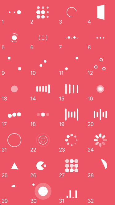
- [x] Available 32 indicators by NVActivityIndicatorView
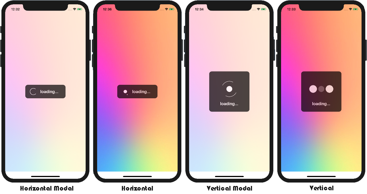
- [x] Support modal view, dismiss and touchable
- [x] Show and stop progress on view everywhere
- [x] Support vertical and horizontal style
- [x] VERY SIMPLE USAGE!
Preview
Cocoapods
Add to Podfile :
pod 'iProgressHUD', '~> 1.1.1'
Indicator Types
Available 32 indicators by NVActivityIndicatorView
| Type | Type | Type | Type |
|---|---|---|---|
| 1. ballPulse | 2. ballGridPulse | 3. ballClipRotate | 4. squareSpin |
| 5. ballClipRotatePulse | 6. ballClipRotateMultiple | 7. ballPulseRise | 8. ballRotate |
| 9. cubeTransition | 10. ballZigZag | 11. ballZigZagDeflect | 12. ballTrianglePath |
| 13. ballScale | 14. lineScale | 15. lineScaleParty | 16. ballScaleMultiple |
| 17. ballPulseSync | 18. ballBeat | 19. lineScalePulseOut | 20. lineScalePulseOutRapid |
| 21. ballScaleRipple | 22. ballScaleRippleMultiple | 23. ballSpinFadeLoader | 24. lineSpinFadeLoader |
| 25. triangleSkewSpin | 26. pacman | 27. ballGridBeat | 28. semiCircleSpin |
| 29. ballRotateChase | 30. orbit | 31. audioEqualizer | 32. circleStrokeSpin |
How to Use
Quick Usage
You can use quick usage with default setting.
import iProgressHUD

class ViewController: UIViewController {
    override func viewDidAppear(_ animated: Bool) {
        // Attach iProgressHUD to views
        iProgressHUD.sharedInstance().attachProgress(toView: self.view)
        // Show iProgressHUD directly from view
        view.showProgress()
    }
}
Custom Usage
You can custom iProgressHUD in your project. Please take a look at iProgressHUD Setting.
import iProgressHUD

class ViewController: UIViewController {
    override func viewDidAppear(_ animated: Bool) {
        let iprogress: iProgressHUD = iProgressHUD()
        iprogress.isShowModal = true
        iprogress.isShowCaption = true
        iprogress.isTouchDismiss = true

        // Attach iProgressHUD to views
        iprogress.attachProgress(toViews: view, view1, view2, view3)

        // Show iProgressHUD directly from view
        view.showProgress()
        view1.showProgress()
        view2.showProgress()
        view3.showProgress()
    }
}
Show/Dismiss iProgressHUD
You can show or dismiss iProgressHUD directly from a view that already attached the progress.
// Show iProgressHUD directly from view
view.showProgress()
// Stop iProgressHUD directly from view
view.dismissProgress()
Update Caption & Indicator On The Fly
You can change caption and indicator types on the fly directly from the view.
// Change caption on the fly directly from the view
view.updateCaption(text: "New Caption Here!")
// Change indicator type on the fly directly from the view
view.updateIndicator(style: .ballBeat)
Add Delegete
Add iProgressHUDDelegete to your class/ViewController to get response onShow, onDismiss or onTouch. This method is optional to implement.
import iProgressHUD

class ViewController: UIViewController, iProgressHUDDelegete {
    override func viewDidAppear(_ animated: Bool) {
        let iprogress: iProgressHUD = iProgressHUD()

        // Set the delegete
        iprogress.delegete = self

        // Attach iProgressHUD to views
        iprogress.attachProgress(toViews: view)

        // Show iProgressHUD directly from view
        view.showProgress()
    }

    func onShow(view: UIView) {
        print("onShow")
    }

    func onDismiss(view: UIView) {
        print("onStop")
    }

    func onTouch(view: UIView) {
        print("onTouch")
    }
}
iProgressHUD Setting
/** Setting indicator style. Default is ballClipRotatePulse. */
iprogress.indicatorStyle = .ballClipRotatePulse

/** Setting iprogress style in vertical or horizontal. Default is vertical. */
iprogress.iprogressStyle = .vertical

/** Setting the indicator size in percent of box view. Default is 60%. */
iprogress.indicatorSize = 60

/** Setting the alpha of modal view. Default is 0.7 */
iprogress.alphaModal = 0.7

/** Setting the alpha of box view. Default is 0.7 */
iprogress.alphaBox = 0.7

/** Setting box size in percent of width view. Default is 50%. */
iprogress.boxSize = 50

/** Setting the corner radius of box view. Default is 12. */
iprogress.boxCorner = 12

/** Setting the caption distance with indicator view. Default is 0. */
iprogress.captionDistance = 0

/** Show or hide the caption view. Default is true. */
iprogress.isShowCaption = true

/** Show or hide the modal view. Default is true. */
iprogress.isShowModal = true

/** Show or hide the box view. Default is true. */
iprogress.isShowBox = true

/** Give blur effect in modal view. Default is false. */
iprogress.isBlurModal = false

/** Give blur effect in box view. Default is false. */
iprogress.isBlurBox = false

/** Make the progress touchable. Default is false. */
iprogress.isTouchDismiss = false

/** Change the modal view color. Default is white. */
iprogress.modalColor = .white

/** Change the box view color. Default is black. */
iprogress.boxColor = .black

/** Change the text color of caption. Default is white. */
iprogress.captionColor = .white

/** Change the indicator view color. Default is white. */
iprogress.indicatorColor = .white

/** Change the font size of caption. Default is 20. */
iprogress.captionSize = 20
Note : Please take a look at iProgressHUDDemo for detail usage.
MIT License
Copyright (c) 2018 Saiful Irham Wicaksana

Permission is hereby granted, free of charge, to any person obtaining a copy
of this software and associated documentation files (the "Software"), to deal
in the Software without restriction, including without limitation the rights
to use, copy, modify, merge, publish, distribute, sublicense, and/or sell
copies of the Software, and to permit persons to whom the Software is
furnished to do so, subject to the following conditions:

The above copyright notice and this permission notice shall be included in all
copies or substantial portions of the Software.

THE SOFTWARE IS PROVIDED "AS IS", WITHOUT WARRANTY OF ANY KIND, EXPRESS OR
IMPLIED, INCLUDING BUT NOT LIMITED TO THE WARRANTIES OF MERCHANTABILITY,
FITNESS FOR A PARTICULAR PURPOSE AND NONINFRINGEMENT. IN NO EVENT SHALL THE
AUTHORS OR COPYRIGHT HOLDERS BE LIABLE FOR ANY CLAIM, DAMAGES OR OTHER
LIABILITY, WHETHER IN AN ACTION OF CONTRACT, TORT OR OTHERWISE, ARISING FROM,
OUT OF OR IN CONNECTION WITH THE SOFTWARE OR THE USE OR OTHER DEALINGS IN THE
SOFTWARE.