Documentation for themers using Laetus 3
Laetus 3 Documentation

Please Note: This document is a work in progress.
Introduction
This documentation page details how to create themes for Laetus 3!
Laetus is temporarily only available to SparkDev Members or designers.
If you are a designer/developer please contact me on my Discord server and I’ll happily give you access.
Themes
Laetus themes are stored in /Library/Laetus/Themes
Laetus 3 supports several different types of themes:
Image Themes
Image themes are simply themes constructed using purely images. These images need to be formatted in the correct way, both in size and in file name.
There are various files you can provide, all of which are optional.
Image Theme Names
Full list of possible file names:
KeyboardMainBG - This image is used as the background behind the keys.
KeyboardNumbersBG - This image is used as the background behind the number keys (If not provided KeyboardMainBG is used).
KeyboardNumberPadBG - This image is used as the background behind the number pad (If not provided KeyboardMainBG is used).
KeyboardEmojiBG - This image is used as the background behind the emoji keys (If not provided KeyboardMainBG is used).
KeyboardDictationBG - This image is used as the background behind the dictation keys (If not provided KeyboardMainBG is used).
KeyboardPredictionBarBG - This image is used as the background behind the prediction keys.
KeyboardLettersKeyPlane - This image is used on the letters screen, above the background (The backgrounds behind the key letters).
KeyboardNumbersKeyPlane - This image is used on the numbers screen, above the background (The backgrounds behind the key letters).
KeyboardNumberPadKeyPlane - This image is used on the number pad screen, above the background (The backgrounds behind the key letters).
KeyboardPressedKeyCap - This image is used behind the key popup when tapping on a key (Experimental).
KeyboardAutoFillBG - This image is used as the background behind the login auto fill screen. (If not provided KeyboardMainBG is used).
KeyboardPickerBG - This image is used as the background behind the 'picker' view (If not provided KeyboardMainBG is used).
Image Theme Name Formatting
All of the images listed above can have extra filters applied to them to give a better experience to the end user. This information can be provided as part of the file name as so:
{IMAGE_NAME}[Portrait|Landscape][-{REGION}][-{SCREEN_HEIGHT}h].png
For example, if you wanted to provide a different “KeyboardMainBG” for Portrait and Landscape you could do:
KeyboardMainBGPortrait.png
KeyboardMainBGLandscape.png
Or to provide a different keyplane for a specific language (for example UK English - en_GB), you could provide:
KeyboardLettersKeyPlanePortrait-en_GB.png
KeyboardLettersKeyPlaneLandscape-en_GB.png
Or maybe you only want that image to be used on an iPhone X?
KeyboardLettersKeyPlanePortrait-en_GB-812h.png
KeyboardLettersKeyPlaneLandscape-en_GB-812h.png
Images can be provided with a scale also (remember to scale the image appropriately for best results).
[email protected]
All images can also be prefixed with an application bundle identifier, in order to give the ability to set images for a specific app.
This would look like so:
com.apple.MobileSMS-KeyboardLettersKeyPlanePortrait-en_GB-812h@3x.png
OR
[email protected]
Image Theme Sizes
The best sizes will differ from device to device, particularly for the keyplanes (Which may also differ across languages).
I will be populating this section as I learn the best sizes for different screens:
Notched 'Max' Devices (e.g. XS Max, 11 Pro Max):
    Screen Height: 896
    Main BG Portrait @3x: 1242 x 906
    Main BG Landscape @3x: 2688 x 513
    Prediction Bar BG Portrait @3x: 1242 x 135
    Prediction Bar BG Landscape @3x: 1986 x 114
    AutoFill/Picker BG Portrait @3x: 1242 x 561
    AutoFill/Picker BG Landscape @3x: 2688 x 519

Notched 3x Devices (e.g. X, 11 Pro):
    Screen Height: 812
    Main BG Portrait @3x: 1125 x 876
    Main BG Landscape @3x: 2436 x 627
    Prediction Bar BG Portrait @3x: 1125 x 135
    Prediction Bar BG Landscape @3x: 2436 x 114
    AutoFill/Picker BG Portrait @3x: (Unknown - Create a pull request to add!)
    AutoFill/Picker BG Landscape @3x: (Unknown - Create a pull request to add!)

Notched 2x Devices (e.g. XR, 11):
    Screen Height: 812
    Main BG Portrait @2x: 828 x 604
    Main BG Landscape @2x: 1792 x 342
    Prediction Bar BG Portrait @2x: 828 x 90
    Prediction Bar BG Landscape @2x: 1792 x 76
    AutoFill/Picker BG Portrait @2x: (Unknown - Create a pull request to add!)
    AutoFill/Picker BG Landscape @2x: (Unknown - Create a pull request to add!)

Non-Notched 'Plus' Devices (e.g. 7 Plus, 8 Plus):
    Screen Height: 667
    Main BG Portrait @3x: 1242 x 678
    Main BG Landscape @3x: 2208 x 492
    Prediction Bar BG Portrait @3x: 1242 x 135
    Prediction Bar BG Landscape @3x: 2208 x 114
    AutoFill/Picker BG Portrait @3x: (Unknown - Create a pull request to add!)
    AutoFill/Picker BG Landscape @3x: (Unknown - Create a pull request to add!)

Non-Notched 2x Devices (e.g. 7, 8):
    Screen Height: 667
    Main BG Portrait @2x: 750 x 432
    Main BG Landscape @2x: 1334 x 328
    Prediction Bar BG Portrait @2x: 750 x 88
    Prediction Bar BG Landscape @2x: 1334 x 76
    AutoFill/Picker BG Portrait @2x: (Unknown - Create a pull request to add!)
    AutoFill/Picker BG Landscape @2x: (Unknown - Create a pull request to add!)

Non-Notched Small 2x Devices (e.g. SE-1):
    Screen Height: 568
    Main BG Portrait @2x: 640 x 508
    Main BG Landscape @2x: 1136 x 404
    Prediction Bar BG Portrait @2x: 640 x 76
    Prediction Bar BG Landscape @2x: 1136 x 76
    AutoFill/Picker BG Portrait @2x: (Unknown - Create a pull request to add!)
    AutoFill/Picker BG Landscape @2x: (Unknown - Create a pull request to add!)
I will be putting together an example pack containing empty images for all of these sizes very soon.
Image Theme Format
As with all Laetus themes, the theme should be a folder in /Library/Laetus/Themes.
Images of the theme must be stored in a sub-folder called Images
This GitHub repository includes an example theme showing the structure and some example images. However, the structure looks as follows:

Themes can then be packaged into a deb file the same way traditional iOS themes are (e.g. for SnowBoard or other theming engines).
HTML Themes
HTML themes are essentially simply a web page shown behind the keyboard, but Laetus provides more power to this webview to make it more interesting.
An example of an HTML theme could be as simple as a HTML page (Named “index.html”) like so:
<html>
    <head>
        <meta name="viewport" content="initial-scale=1.0" />
    </head>
    <body>
        <h1>Hello World!</h1>
    </body>
</html>
However, it is also possible to include css/js/other content from the same folder as your theme. Therefore, you can include a JavaScript file like so:
<html>
    <head>
        <meta name="viewport" content="initial-scale=1.0" />
        <script src="Example.js"></script>
    </head>
    <body>
        <h1>Hello World!</h1>
    </body>
</html>
HTML Theme Javascript Callbacks
Laetus provides some extra useful information to HTML themes via Javascript.
All callbacks are option and do not need to be overridden in your theme.
The callbacks are as follows:
laetusKeyPlaneDidChange(state) - Called when the keyboard becomes visible or the keyboards 'KeyPlane' changes. The possible states are: "Letters", "CapitalLetters", "Numbers", "NumbersAlternate", "Emoji", "NumberPad".
laetusRawKeyPlaneDidChange(state) - Called when the keyplane changes. This is the raw value used by iOS internally, so may give more information.

laetusDictationViewWillShow() - Called when the dictation view appears
laetusDictationViewWillHide() - Called when the dictation view disappears

laetusDidTouchDown(x,y) - Called when the user taps on the keyboard. Provides the x,y position relative the view. (e.g. 0,0 for the top left).

laetusCurrentLanguage(language) - Called when the keyboard becomes visible or when the language changes. Language is provided directly from the keyboard APIs and appears to always conform to the ISO language standard (e.g. en_GB). - More information here (https://en.wikipedia.org/wiki/Language_localisation), note that hyphens will be returned as underscores.

laetusEnabledLanguages(languagesArray) - Called whenever the other notifications are updated. Just includes an array of the languages enabled by the user. These are the languages shown when tapping the globe icon in the keyboard. (Again the ISO language key).
An example of overriding one of these methods would look as follows, from the “Example.js” file:
function laetusKeyPlaneDidChange(keyplaneName)
{
    console.log("KeyPlane did change to: " + keyplaneName);
}
Or you could get the element at the current position like so:
function laetusDidTouchDown(x, y)
{
    var elem = document.elementFromPoint(x, y);
}
HTML Theme Format
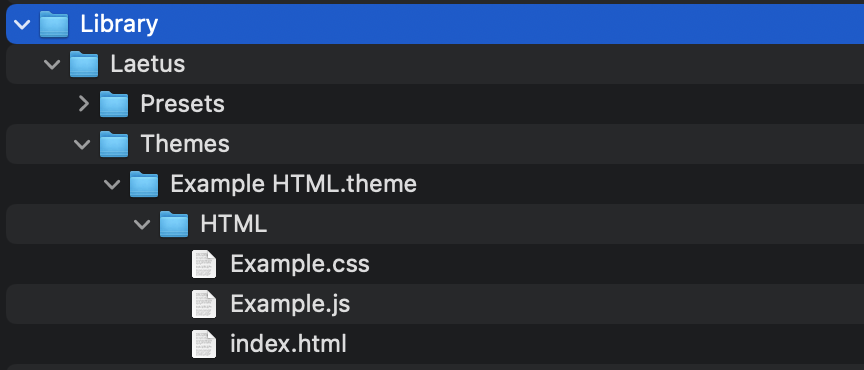
As with all Laetus themes, the theme should be a folder in /Library/Laetus/Themes.
Files for the theme must be stored in a sub-folder called HTML
This GitHub repository includes an example theme showing the structure and an example HTML theme. However, the structure looks as follows:
Themes can then be packaged into a deb file the same way traditional iOS themes are (e.g. for SnowBoard or other theming engines).
Widget Themes
If you have any experience with objective-c/tweak development, it’s super easy to get started with Laetus Widgets. Let’s get going!
Pre-Requirements
Laetus >= 3.0.0 (Available from: https://sparkdev.me)
Simple Implementation
Included in this git is a ‘LaetusWidgetTemplate’ which contains a fully compilable template of a simple Laetus widget.
The template simply displays a red background, so take a look at this. For the easiest experience, build your widgets starting from this template.
Laetus widgets must conform to the ‘LaetusWidget’ protocol. This is included in the ‘LaetusWidgetProtocol.h’ API header file.
// This is the protocol that your Laetus widget class must conform to
@protocol LaetusWidgetProtocol <NSObject>

@required
// Setup your content view and set the frame. (Note this could change via setFrame on the content view).
-(void) setupWithFrame:(CGRect) frame;
// Return the contentview (Return NULL if not setup).
-(UIView*) contentView;
// Destroy the contentview. Make sure after this that the above function returns NULL.
-(void) destroyContentView;

@optional
// When a touch is detected, it will be passed to this function and provided via 'point'.
-(void) receiveTouchAtPoint:(CGPoint) point;
// Called when the keyplane changes. Can either be: @"Letters" or @"Numbers" or @"NumbersAlternate" or @"Emoji".
-(void) keyPlaneDidChange:(NSString*) keyPlaneName;
// Called when the keyplane changes. This is the raw value used by iOS internally, so may give more information.
-(void) rawKeyPlaneDidChange:(NSString*) keyPlaneName;
// Called when the language changes. Language is provided directly from the keyboard APIs and appears to always conform to the ISO language standard (e.g. en_GB). - More information here (https://en.wikipedia.org/wiki/Language_localisation), note that hyphens will be returned as underscores.
-(void) updateCurrentLanguage:(NSString*) language;
// Called to inform the widget of which languages are available. These are the languages shown when tapping the globe icon in the keyboard.
-(void) setEnabledLanguages:(NSArray*) languages;
// Called when the dictation view shows.
-(void) dictationViewWillShow;
// Called when the dication view hides.
-(void) dictationViewWillHide;
@end
This protocol may be expanded to provide more information in future Laetus updates.
A quick example of a class that would conform to this protocol would be as follows:
#import "LaetusWidgetProtocol.h"

@interface LaetusWidgetTemplate : NSObject <LaetusWidgetProtocol>
@property (nonatomic, retain) UIView* contentView;
@end

@implementation LaetusWidgetTemplate
    -(void)setupWithFrame:(CGRect) frame
    {
        if(self.contentView == NULL)
        {
            self.contentView = [[UIView alloc] initWithFrame: frame];
        }

        [self.contentView setFrame: frame];
        self.contentView.backgroundColor = [UIColor redColor];
    }

    -(void) destroyContentView
    {
        if(self.contentView)
        {
            [self.contentView removeFromSuperview];
            self.contentView = NULL;
        }
    }
@end
Once you have a class that conforms to the Laetus widget protocol, you need an Info.plist file to tell Laetus about your widget.
This is formatted like so:
<?xml version="1.0" encoding="UTF-8"?>
<!DOCTYPE plist PUBLIC "-//Apple//DTD PLIST 1.0//EN" "http://www.apple.com/DTDs/PropertyList-1.0.dtd">
<plist version="1.0">
    <dict>
        <key>CFBundleIdentifier</key>
        <string>com.spark.laetus.widgettemplate</string>

        <key>CFBundleDisplayName</key>
        <string>Laetus Widget Template</string>

        <key>LaetusWidgetClass</key>
        <string>LaetusWidgetTemplate</string>

        <key>LaetusWidgetsVersion</key>
        <integer>1</integer>
    </dict>
</plist>
This Info.plist file but be in your bundle alongside the binary, so see the ‘Makefile’ in the template if you do not know how to copy this over.
Your widget bundle file must then be placed in “/Library/Laetus/Themes” for Laetus to find it, this is also covered in the ‘Makefile’.
Once your Widget is built and has the Info.plist file, it will be available in the Laetus widgets selector and you’re done!
Hybrid Themes
Laetus also supports using a combination themes.
To package a theme like this, simply include both Images and HTML sub-folders.
Widget themes can also include some specific images from Images themes in it’s bundle.
Presets
Presets can be used by both designers and users alike. To create a preset go to Laetus preferences > Presets > And tap the ‘+’ button.
Presets simply are a copy of the Laetus preferences file, so DO NOT include your theme and/or images.
However, these can be useful to provide alongside packaged themes to setup the user preferences in the way you are expecting (e.g. text colour, hide key caps, etc.)
Presets are stored in /Library/Laetus/Presets, and can be packaged as part of your deb file the same way traditional iOS themes are (e.g. for SnowBoard or other theming engines).
Thanks
Thanks to Tr1Fecta for helping with finding device image sizes