React multistep wizard component
Responsive React multistep form component
New version from moreteza mehrdad
Take it for a SPIN! 💫
List of contributors 🙌
Previous MultiStep major version, v5.4.0
Version 5.x.x is in a maintenance mode, the new development is ongoing on v6.x.x. Version (v5.x.x) bug fixes will still be available on NPM, if you would like to open a PR for a fix or make a fork, git checkout branch v5.x.x. The new version, v6.0.0 has a multiple improvements (see below) and is not backwards compatible.
Instructions
To use this module in your app run:
npm install react-multistep
next, import it inside of your app:
import MultiStep from "react-multistep";
and then, in your application, you add your custom components/forms this way:
<MultiStep activeStep={0} prevButton={prevButton} nextButton={nextButton}>
  <StepOne title="Step 1" />
  <StepTwo title="Step 2" />
</MultiStep>
MultiStep component accepts following props (all optional, except Steps array):
| PROPERTY | DESCRIPTION | TYPE | DEFAULT | isRequired |
|---|---|---|---|---|
| showTopNav | controls if the navigation buttons are visible | boolean | true | false |
| prevButton | configure the prev navigation button | NavButtonProp | null | false |
| nextButton | configure the next the navigation button | NavButtonProp | null | false |
| stepCustomStyle | control style of step | CSSProperties | null | false |
| direction | control the steps nav direction | column | row | false |
| activeStep | it takes a number representing representing starting step | number | 0 | false |
🚀 NEW! you can also use style props for the navigation buttons and change how they look with two props ‘prevButton’ & ‘nextButton’:
| PROPERTY | DESCRIPTION | TYPE | DEFAULT | isRequired |
|---|---|---|---|---|
| title | The display string value of the navigation button | string | Prev / Next | false |
| style | The css style of the navigation button | CSSProperties | null | false |
To configure Multistep component, we inline child components:
<MultiStep
activeStep={2}
prevButton={{title: 'Back','style:{ background: 'red' }}}
nextButton={{title: 'Forward','style:{ background: 'green' }}}
>
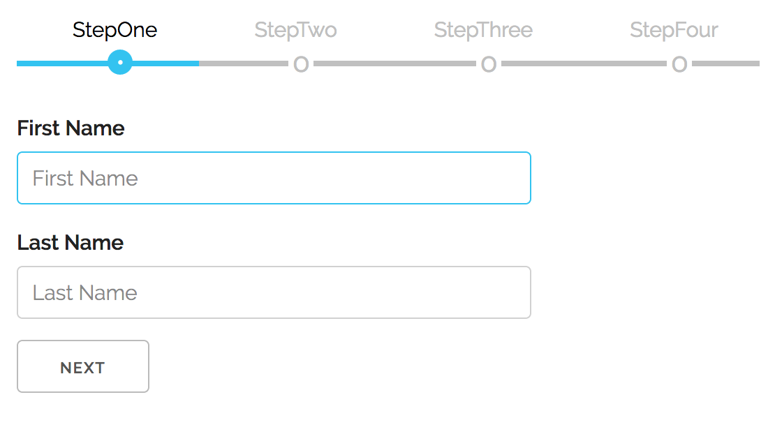
<StepOne title='StepOne'/>
<StepTwo title='StepTwo'/>
<StepThree title='StepThree'/>
<StepFour title='StepFour'/>
</MultiStep>
When configured this way, each component (Step) of the array can have following two properties:
| PROPERTY | DESCRIPTION | TYPE | DEFAULT | isRequired |
|---|---|---|---|---|
| component | the step representing component | JSX.Element | null | true |
| title | the step title, present above the steps nav | text | step index | false |
🚀 NEW! Feature: Controlling navigation to the next step with form validation
To enable this feature, when the child form component needs to control ‘Next’ navigational button, based on it’s local validation, MultiStep dynamically adds a new prop function to child components that should be used to signal validation status. MultiStep will disable /enable Next button accordingly. This function has follwing signature:
signalParent(valid: boolean)
By default the state is false and child components invokes it based on current outcome of the validation. In the example app, a simple checkbox is used to simulate valid/not valid.
This can be seen in the example app, but here are the relevant parts, required inside of the form child component:

Instructions for local development
If you would like to explore further, contribute a PR or just try the included code example:
Start by cloning the repo locally:
git clone https://github.com/srdjan/react-multistep.git
then:
cd react-multistep            // (1) navigate to the project folder
npm install                   // (2) install dependencies
npm run build                 // (3) build the component
On a successful build, try the example app:
cd ../example                 // (1) navigate to the example folder
npm install                   // (2) install dependencies
npm run build                 // (3) build the example
npm start                     // (4) start the local server
Now, you can open the example in your favorite browser…