A Google Keep-like Date and Time Picker for reminders
Date and time pickers have always been a hassle for me (no matter how awesome they looked). Having
to choose from a few hundred numbers felt overwhelming and was neither intuitive nor fast. Luckily,
Google found a sleek solution in the Notes app which I decided to replicate:
ReminderDatePicker
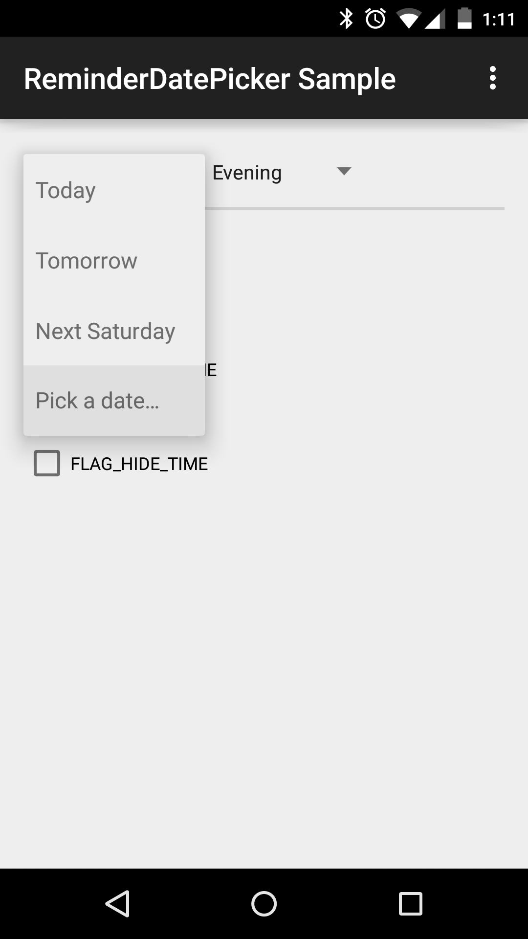
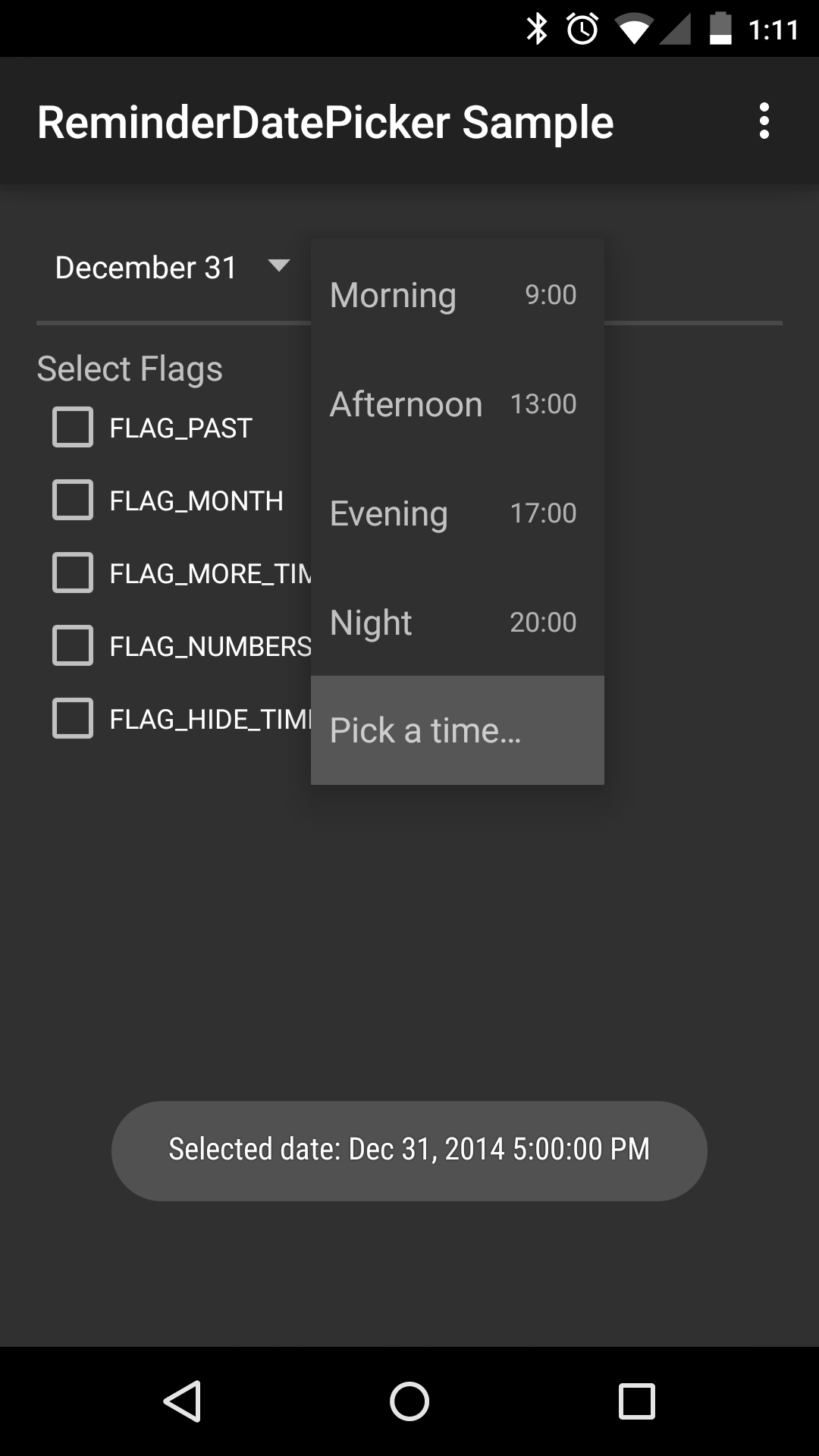
An intuitive and simplistic Date and Time Picker for reminders. Per default it almost exactly
matches the picker seen in the Google Notes App
but adds important features and enhancements. You can download the sample app in the Play Store here to test it!
Screenshots


Set-up
To use this library in your project either
-
Add this line to the dependencies in your build.gradle (note you need
mavenCentral()in your repositories):
compile 'com.simplicityapks:reminderdatepicker:1.3.+' -
Copy the library into your workspace and add it as library in Eclipse
or addcompile project(':lib')to the dependencies in your build.gradle in Android Studio.
In Eclipse, you will need to right click on the java folder in this project and select Build Path–>Use as Source Folder.
Also, make sure you have configured both the appcompat support (v7) library
and the DateTimePicker correctly and referenced as library.
The library is designed for Android ICS and above (API level 14+), but it works fine in Android 2.1+
as well (only the spinners use a dialog instead of the popup menu). Note that you need to use NineOldAndroids
on pre-Honeycomb for the additional DateTimePicker
that is integrated out of the box.
Usage
Simply construct a new ReminderDatePicker
or add it to your layout xml files:
<com.simplicityapks.reminderdatepicker.lib.ReminderDatePicker
    android:id="@+id/date_picker"
    android:layout_width="wrap_content"
    android:layout_height="wrap_content"/>
See the sample source code for more information.
###Flags and Modes
This library supports different behaviours and selectable dates. Based on your needs, call setFlags()
or use the app:flags="..." attribute in the xml declaration with one or more of the
ReminderDatePicker.FLAG_… or .MODE_… constants (combined with the | operator). For example
use app:flags="month|more_time" for a larger set of selectable days and hours.
Furthermore, you can restrict which days are enabled in the date spinner by calling setMinDate() and
setMaxDate(). Per default, dates in the past are not user-selectable, but you can re-enable them
by calling setMinDate(null) or using FLAG_PAST.
###Custom additional date or time picker
After clicking on the footer in one of the spinners, the additional date or time picker will open as
dialog. These are the standard pickers from the Android framework, made Android 2.1+ compatible by
DateTimePicker. You can, however, use a custom
date or time picker or even implement your own behaviour. To achieve this simply call setCustomDatePicker()
or setCustomTimePicker(), passing an OnClickListener whose onClick() method will be called when the
footer is clicked.
###Custom date and time spinner items
Date and time spinner parse their items from an xml resource file, R.xml.date_items
and R.xml.time_items respectively. That means you can implement
a custom item list by overriding those files: In each DateItem or TimeItem xml tag you should
provide an id and text attribute (if text is left out the date will be formatted instead).
To declare the item’s date (or time), you can use the abs... and rel... attributes, where rel
means relative to the current date and time and abs the absolute value. See the XML_ATTR_…
constants in the spinners for the supported tags.
Likewise, it is possible to add and remove spinner items at runtime using addAdapterItem(),
insertAdapterItem() and removeAdapterItemById(). The id value passed to an item’s constructor
can be any integer, but should preferably be a resource id declared in ids.xml.
###Advanced Usage
DateSpinner and
TimeSpinner can be
used separately (when FLAG_HIDE_TIME does not suffice) and each listen for the xml flags as well.
But make sure you use style="@style/PickerSpinner" in the spinner’s xml layout tag!
Alternatively, if you have a totally different usage and need the spinners used here, let your custom
Spinner extend PickerSpinner
(which uses a PickerSpinnerAdapter).
That way your spinner will have a footer, secondary texts and the ability to have a temporary selection.
The class also allows easy dynamic changes to the spinner items without having to check and reset
the selection.
Credits
Huge thanks to
- Google for the original design of this picker in Google Keep
- flavienlaurent for his awesome DateTimePicker
- jaydeep17 for forking and continuing work on the DateTimePicker
- chrisbanes for his maven_push.gradle script which brought this lib to maven central
- Oxygen Team for designing the icon of the sample app
- dancer_69 for the Greek translation
- dahool for the Spanish translation
- rampo for the Italian translation
- erickpires for the Brazilian Portuguese translation
- Cüneyt Ayyıldız for the Turkish translation
License
Copyright 2014 SimplicityApks

Licensed under the Apache License, Version 2.0 (the "License");
you may not use this file except in compliance with the License.
You may obtain a copy of the License at

   http://www.apache.org/licenses/LICENSE-2.0

Unless required by applicable law or agreed to in writing, software
distributed under the License is distributed on an "AS IS" BASIS,
WITHOUT WARRANTIES OR CONDITIONS OF ANY KIND, either express or implied.
See the License for the specific language governing permissions and
limitations under the License.
See the LICENSE file for more information.