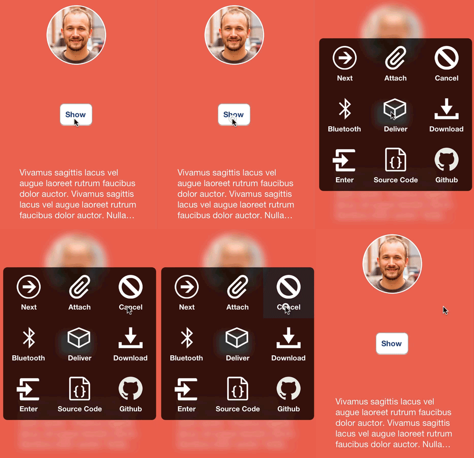
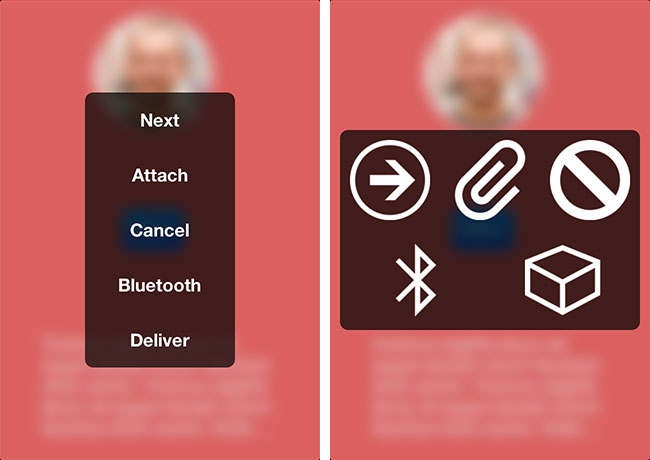
A grid menu with elastic layout, depth of field, and realistic animation.
RNGridMenu
A grid based menu view with field depth and bounce animation: inspired by Mailbox, and extended for multiple needs. I created this project out of a stint of boredom. This control is customizable to a degree, but kept simple so you can take it and spin your own subclass or fork out of it.


Installation
Installation with CocoaPods made available by thaberkern. Just add this line to your Podfile.
pod 'RNGridMenu', '~> 0.1.2'
Drag and drop the RNGridMenu .h and .m files into your project. To get this working, you’ll need to include the following frameworks:
- QuartCore
- Accelerate
Usage
Getting started with RNGridMenu is dead simple. Just initialize it with a list of options, images, or both, and call the -show method. Like this:
NSArray *images = //...
NSArray *options = //...
RNGridMenu *av = [[RNGridMenu alloc] initWithOptions:options images:images delegate:self];
[av show];
There are 3 initialization methods in all for now. Note that the delgate is entirely optional. Just set that parameter to nil (though the control is kind of useless without it, right?).
// Note this changes the view to style RNGridMenuStyleList since there are no images
- (id)initWithOptions:(NSArray *)options delegate:(id <RNGridMenuDelegate>)delegate;

- (id)initWithImages:(NSArray *)images delegate:(id <RNGridMenuDelegate>)delegate;

// The count of both options and images must be equal (caught with assert)
- (id)initWithOptions:(NSArray *)options images:(NSArray *)images delegate:(id <RNGridMenuDelegate>)delegate;
Customization
@property (nonatomic, copy) UIColor *highlightColor;
The color that items will be highlighted with on selection. Defaults to table view selection blue.
@property (nonatomic, strong, readonly) UIColor *backgroundColor;
The background color of the main view (note this is a UIViewController subclass). Default is black with 0.7 alpha.
@property (nonatomic, assign) CGSize itemSize;
The size of a list or grid item. Default is 100x100.
@property (nonatomic, assign) CGFloat blurLevel;
The level of blur for the background image. Range is 0.0 to 1.0. Default is 0.3.
@property (nonatomic, assign) BOOL addsToWindow;
Set to YES if you want to add the control to the window of your app. Default is NO.
@property (nonatomic, assign) CGFloat animationDuration;
The time in seconds for the show and dismiss animation. Default is 0.25.
@property (nonatomic, copy) UIColor *itemTextColor;
The text color for list items. Default is white.
@property (nonatomic, copy) UIFont *itemFont;
The font used for list items. Default is bold size 14.
@property (nonatomic, assign) NSTextAlignment itemTextAlignment;
The text alignment of the item titles. Default center alignment.
@property (nonatomic, assign) RNGridMenuStyle menuStyle;
The list layout. Default RNGridMenuStyleGrid. Options are
RNGridMenuStyleDefault
RNGridMenuStyleList
@property (nonatomic, strong) UIView *headerView;
An optional header view. Make sure to set the frame height when setting. Same usage as UITableView header.
Credits
I finally got a solid implementation on responding to orientation changes by looking at the source of MBAlertView. Great project if you haven’t seen it.
Sample icons provided by IcoMoon.
I followed Peter Steinberger’s post on setting up UIAppearance.
The blurring algorithm was initially used from this post but then perfected by Club15CC in a pull request for RNBlurModalView.
Apps
If you’ve used this project in a live app, please let me know! Nothing makes me happier than seeing someone else take my work and go wild with it.
Todo
Images onlyVertical list with text only- Advanced styles - Item borders, gradients (Mailbox)
- UIAppearance with styles
Title viewReadme- Cocoapods
More screenshots- Optional block callbacks
Contact
- @nystrorm on Twitter
- @rnystrom on Github
- rnystrom [at] whoisryannystrom [dot] com
License
See LICENSE.