Missing button component for tvos
TVOSButton 
Missing button component of tvos.
Built top on UIButton.
Super easy to style, super easy to subclass.
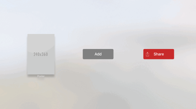
Demo
Installation
CocoaPods
pod 'TVOSButton'
Usage
Since TVOSButton is built top on UIButton, its really super easy to create one with either programmatically or trough the storyboard.
TVOSButtonStyle is the key player of your buttons appearance.
tvosButtonStyleForState: function called when the TVOSButtonState is changed.
So you can create dynamically change buttons on runtime.
Overriding tvosButtonStyleForState: function will enough for most cases in your TVOSButton subclasses. Detailed examples available in the project.
If you don’t use any style, it will render default style just like UIButtonType.System.
Here is the code of example IconButton subclass in the example project.
class IconButton: TVOSButton {

  var iconName: String? {
    didSet {
      handleStateDidChange()
    }
  }

  override func tvosButtonStyleForState(tvosButtonState: TVOSButtonState) -> TVOSButtonStyle {

    // custom content
    let icon = UIImageView(frame: CGRect(x: 20, y: 0, width: 40, height: 40))
    icon.center.y = 50
    if let iconName = iconName {
      let color = tvosButtonState == .Highlighted || tvosButtonState == .Focused ? "Black" : "White"
      icon.image = UIImage(named: "\(iconName)\(color)")
    }

    switch tvosButtonState {
    case .Focused:
      return TVOSButtonStyle(
        backgroundColor: UIColor.whiteColor(),
        cornerRadius: 10,
        scale: 1.1,
        shadow: TVOSButtonShadow.Focused,
        contentView: icon,
        textStyle: TVOSButtonLabel.DefaultText(color: UIColor.blackColor()))
    case .Highlighted:
      return TVOSButtonStyle(
        backgroundColor: UIColor.whiteColor(),
        cornerRadius: 10,
        scale: 0.95,
        shadow: TVOSButtonShadow.Highlighted,
        contentView: icon,
        textStyle: TVOSButtonLabel.DefaultText(color: UIColor.blackColor()))
    default:
      return TVOSButtonStyle(
        backgroundColor: UIColor(red: 198/255.0, green: 44/255.0, blue: 48/255.0, alpha: 1),
        cornerRadius: 10,
        contentView: icon,
        textStyle: TVOSButtonLabel.DefaultText(color: UIColor.whiteColor()))
    }
  }
}
Creating an instance from IconButton just looks like this:
    iconButton.textLabelText = "Share"
    iconButton.iconName = "share"
TVOSButtonStyle
It is a struct with style data in it.
public struct TVOSButtonStyle {

  // Button Style
  public var backgroundColor: UIColor?
  public var backgroundImage: UIImage?
  public var cornerRadius: CGFloat?
  public var scale: CGFloat?
  public var shadow: TVOSButtonShadow?

  // Button Content Style
  public var contentView: UIView?
  public var badgeStyle: TVOSButtonImage?
  public var textStyle: TVOSButtonLabel?
  public var titleStyle: TVOSButtonLabel?
}
TVOSButtonImage, TVOSButtonLabel and TVOSLabelShadow also enums that using TVOSButtonImageStyle, TVOSButtonLabelStyle and TVOSButtonShadowStyle structs to create styles.
TVOSButtonState
It is a wrapper around UIControlState optimized for listening state changes and tvos only events like focus.
public enum TVOSButtonState {
  case Normal
  case Focused
  case Highlighted
  case Disabled
}