:honey_pot: Test Driven Style Guide Development - Angular (4.x and above)
UI-jar
Test Driven Style Guide Development - Angular (4.x and above)
A drop in module to automatically create a living style guide based on the test you write for your components.
Bundle with your favorite build tool and you will automatically get a web app where you can view examples of each component together with associated documentation.
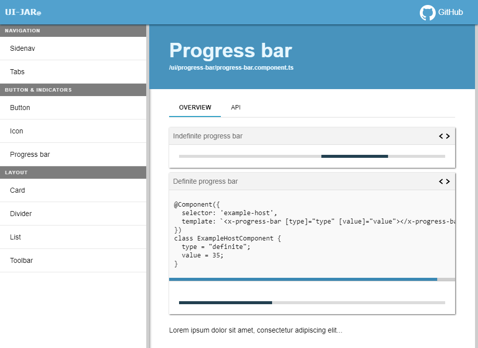
Demo
Example project setup
Step-by-step setup with Angular CLI
Download latest Angular CLI and generate your app
> npm install @angular/cli -g
> ng new my-app
> cd my-app
> npm install ui-jar
> ng generate application ui-jar
Open package.json and add following in “scripts”.
    "ui-jar": "node node_modules/ui-jar/dist/bin/cli.js --directory ./src/app/ --includes \\.ts$",
    "start-ui-jar-example": "npm run ui-jar && ng serve ui-jar"
Open “projects/ui-jar/tsonfig.app.json” and add following:
"exclude": [
    ...
    "../../src/**/*.spec.ts"
]
"include": [
    "**/*.ts",
    "../../src/**/*.ts"
]
Open “projects/ui-jar/main.ts” and replace content with following:
import { enableProdMode } from '@angular/core';
import { platformBrowserDynamic } from '@angular/platform-browser-dynamic';
import { environment } from './environments/environment';
import { UIJarModule } from 'ui-jar';

if (environment.production) {
  enableProdMode();
}

platformBrowserDynamic().bootstrapModule(UIJarModule);
Open “projects/ui-jar/index.html” and replace content with following:
<!doctype html>
<html lang="en">
<head>
  <meta charset="utf-8">
  <title>UiJar</title>
  <base href="/">

  <meta name="viewport" content="width=device-width, initial-scale=1">
  <link rel="icon" type="image/x-icon" href="favicon.ico">
</head>
<body>
  <ui-jar-app></ui-jar-app>
</body>
</html>
Open “projects/ui-jar/styles.css” and add following line:
@import url('../../../node_modules/ui-jar/dist/src/styles/default.css');
npm run start-ui-jar-example
Done! 😃
Customizing your UIJar
Custom Styles
You can overwrite the colors using css variables, for example:
@import url('../node_modules/ui-jar/dist/src/styles/default.css');

:root {
  --main-background: #002F24;
  --contrast-color: #fff;
  --accent-color: #000;
  --accent-contrast-color: #fff;
  --scroll-background: #333;
  --scroll-color: #333;
  --example-header-background: #00503E;
  --items-header-background: #00503E;
  --items-header-color: #fff;
  --border-color: rgba(0, 0, 0, .3);
  --menu-item-background-hover: #00503E;
  --menu-item-color: #fff;
  --code-example-background: #333;
  --text-highlight: #ffbb00;
}
Custom Content
To overwrite content (f.e. header title, home page, etc) you just need to define the global variable UIJarConfiguration, please note that it should be created before angular bootstraps.
One way of doing it is to add <script> tag in your index.html, like the following example:
<script>
    window.UIJarConfiguration = {
        title: `My custom title`,
        homeContent: `
            <h1 class="title">Home page!</h1>
            <p>I'm a custom page!</p>
        `
    };
</script>
You can check the app-config.interface.ts file to see all the possible atributes.
Custom installation
npm install ui-jar
CLI
node node_modules/ui-jar/dist/bin/cli.js --directory ./app/root/dir --includes \.ts$ --excludes \.excludes\.ts$ --url-prefix prefix/url
CLI options
- –config - You can send a JSON file with the configurations e.g.:
--config ./ui-jar.config.json
Example config file (ui-jar.config.json):
{
  "directory": "./projects/",
  "includes": [ ".ts$" ],
  "watch": true,
  "urlPrefix": ""
}
- –directory (string) - path to app root dir e.g. “./src/app”
- –includes (RegExp) - space separated list of files to include e.g. “foo\.ts$ bar\.ts$”
- –excludes (RegExp) - space separated list of files to exclude e.g. “a\.component\.ts$ b\.component\.ts$”
- –url-prefix (string) - add prefix to all urls in UI-jar, e.g. “project-a/styleguide”.
- –watch - enable watch-mode, UI-jar will watch on file changes in your test files.
Configuration
Add a entry point to your ui-jar app, e.g ui-jar.ts.
Bundle with your favorite build tool (use the same configuration as your regular app, but with ui-jar.ts as the entry point).
AoT-build is not supported yet.
import { enableProdMode } from '@angular/core';
import { platformBrowserDynamic } from '@angular/platform-browser-dynamic';
import { UIJarModule } from 'ui-jar';

enableProdMode();
platformBrowserDynamic().bootstrapModule(UIJarModule);
<!doctype html>
<html lang="en">
<head>
    <meta charset="utf-8">
    <title>UI-jar</title>
    <base href="/">
    <link rel="stylesheet" href="/node_modules/ui-jar/dist/src/styles/default.css" type="text/css">
</head>
<body>
    <ui-jar-app></ui-jar-app>
    <script src="path/to/your/ui-jar/app/build/bundle.js"></script>
</body>
</html>
Quickstart
- Basic usage
- Usage with a test host component
- Usage with multiple test host components
- HttpClient example with mock requests
- Add more details about your component
Example usage (basic)
Add a JSDoc-comment to your component containing “@group GROUP_NAME” and
“@component COMPONENT_DISPLAY_NAME”.
@group is used to group your components in UI-jar navigation.
@component is used as display name of the component in UI-jar.
Description is not required, add if you like. It will be displayed together with your component in UI-jar.
Source code
import { Component, Input } from '@angular/core';

/**
 * @group Forms
 * @component Checkbox
 * @description
 * <div>It's possible use <b>html</b> in the description</div>
 */
@Component({
    selector: 'x-checkbox',
    templateUrl: './checkbox.component.html',
    styleUrls: ['./checkbox.component.scss']
})
export class CheckboxComponent {
    @Input('isDisabled') isDisabled: boolean = false;
    label: string = 'Item A';

    ...
}
Test code
Add a JSDoc-comment with “@uijar COMPONENT_CLASS_NAME” together with a variable that defines test module definition.
In the example below it’s defined in “beforeEach”.
Also add a JSDoc-comment containing “@uijarexample” to each test you would like to add as a example in UI-jar.
It’s possible to use multiple examples.
import { async, ComponentFixture, TestBed } from '@angular/core/testing';
import { CheckboxComponent } from './checkbox.component';

describe('CheckboxComponent', () => {
    let fixture: ComponentFixture<CheckboxComponent>;

    beforeEach(async(() => {
        /**
         * @uijar CheckboxComponent
         */
        TestBed.configureTestingModule({
            declarations: [CheckboxComponent]
        }).compileComponents().then(() => {
            fixture = TestBed.createComponent(CheckboxComponent);
            fixture.detectChanges();
        });
    }));

    /** @uijarexample Add custom title to example here */
    it('should create component with "isDisabled" set to true', () => {
        fixture.componentInstance.isDisabled = true;
        fixture.componentInstance.label = 'Item A';

        ...
    });

    /** @uijarexample Add custom title to example here */
    it('should create component with "isDisabled" set to false', () => {
        fixture.componentInstance.isDisabled = false;
        fixture.componentInstance.label = 'Item A';

        ...
    });
});
Example usage (with test host component)
Source code
import { Component } from '@angular/core';

/**
 * @group Buttons & indicators
 * @component Buttons
 */
@Component({
    selector: 'button[buttonA]',
    template: '<ng-content></ng-content>',
    styleUrls: ['./button.scss']
})
export class ButtonComponent {
    ...
}
Test code
Sometimes you want to create a test host component for your tests.
It’s possible to view test host components in UI-jar, just add “@hostcomponent HOST_COMPONENT_CLASS_NAME” to the JSDoc-comment where you define your module definition.
In the example below it’s defined in “beforeEach”.
import { async, ComponentFixture, TestBed } from '@angular/core/testing';
import { Component } from '@angular/core';
import { ButtonsModule } from './buttons.module';

describe('ButtonComponent', () => {
    let fixture: ComponentFixture<ButtonComponentTestHost>;

    beforeEach(async(() => {
        /**
        * @uijar ButtonComponent
        * @hostcomponent ButtonComponentTestHost
        */
        TestBed.configureTestingModule({
            imports: [ButtonsModule],
            declarations: [ButtonComponentTestHost]
        }).compileComponents().then(() => {
            fixture = TestBed.createComponent(ButtonComponentTestHost);
            fixture.detectChanges();
        });
    }));

    /** @uijarexample Add custom title to example here */
    it('should create standard button', () => {
        fixture.componentInstance.buttonText = 'Standard button';

        ...
    });
});

@Component({
    selector: 'x-button-test-host',
    template: `<button buttonA>{{buttonText}}</button>`
})
class ButtonComponentTestHost {
    buttonText: string;
}
Example usage (with multiple test host components)
Source code
import { Component } from '@angular/core';

/**
 * @group Buttons & indicators
 * @component Buttons
 */
@Component({
    selector: 'button[buttonA]',
    template: '<ng-content></ng-content>',
    styleUrls: ['./button.scss']
})
export class ButtonComponent {
    ...
}
Test code
Sometimes you want to create multiple test host components for your tests.
It’s possible to view multiple test host components in UI-jar, just add “@hostcomponent HOST_COMPONENT_CLASS_NAME” to the JSDoc-comment where you have your “@uijarexample”-comment.
import { async, ComponentFixture, TestBed } from '@angular/core/testing';
import { Component } from '@angular/core';
import { ButtonsModule } from './buttons.module';

describe('ButtonComponent', () => {
    beforeEach(async(() => {
        /**
         * @uijar ButtonComponent
         */
        TestBed.configureTestingModule({
            imports: [ButtonsModule],
            declarations: [ButtonComponentTestHost, ButtonComponentAnotherTestHost]
        }).compileComponents();
    }));

    /**
     * @uijarexample Add custom title to example here
     * @hostcomponent ButtonComponentTestHost
     */
    it('should create standard button', () => {
        const fixture: ComponentFixture<ButtonComponentTestHost> = TestBed.createComponent(ButtonComponentTestHost);
        fixture.componentInstance.buttonText = 'Standard button';

        ...
    });

    /**
     * @uijarexample Another example with different host component
     * @hostcomponent ButtonComponentAnotherTestHost
     */
    it('should create standard button', () => {
        const fixture: ComponentFixture<ButtonComponentAnotherTestHost> = TestBed.createComponent(ButtonComponentAnotherTestHost);
        fixture.componentInstance.title = 'Custom title';
        fixture.componentInstance.buttonText = 'Standard button';

        ...
    });
});

@Component({
    selector: 'x-button-test-host',
    template: `<button buttonA>{{buttonText}}</button>`
})
class ButtonComponentTestHost {
    buttonText: string;
}

@Component({
    selector: 'x-button-another-test-host',
    template: `
    <h1>{{title}}</h1>
    <button buttonA>{{buttonText}}</button>`
})
class ButtonComponentAnotherTestHost {
    buttonText: string;
    title: string;
}
Example usage (test with HttpClientTestingModule)
You might want to view a component that is requesting resources using HttpClient in UI-jar. Below is an example on that.
Source code
import { Component, Renderer2, ElementRef } from '@angular/core';
import { HttpClient } from '@angular/common/http';

/**
 * @group Icons
 * @component Icon
 */
@Component({
    selector: 'x-icon',
    template: '<ng-content></ng-content>',
    styleUrls: ['./icon.scss']
})
export class IconComponent {
    private _name: string;

    @Input()
    set name(value: string) {
        this._name = value;
        this.setSvgIcon(this._name);
    }

    constructor(private http: HttpClient, private renderer: Renderer2,
                private elementRef: ElementRef) { }

    private setSvgIcon(name: string): void {
        this.getSvgIcon(name).subscribe((svgIcon) => {
            this.renderer.appendChild(this.elementRef.nativeElement, svgIcon);
        });

        ...
    }

    private getSvgIcon(name: string): Observable<SVGElement> {
        return this.http.get(`/cdn/url/${name}.svg`).pipe(map((response) => { ... }));
    }

    ...
}
Test code
Notice the use of “HttpClientTestingModule” and “HttpTestingController”.
UI-jar will automatically detect each requests you would like to fake for a specified resource if you use “expectOne” on “HttpTestingController”. Use “flush” and “error” on “TestRequest” to manage which result you would like to have on your requests.
import { async, ComponentFixture, TestBed } from '@angular/core/testing';
import { Component } from '@angular/core';
import { HttpClientTestingModule, HttpTestingController, TestRequest } from '@angular/common/http/testing';
import { IconComponent } from './icon.component';

describe('IconComponent', () => {
  let fixture: ComponentFixture<IconComponent>;
  let httpMock: HttpTestingController;

    beforeEach(async(() => {
        /**
        * @uijar IconComponent
        */
        TestBed.configureTestingModule({
            imports: [HttpClientTestingModule],
            declarations: [IconComponent],
        }).compileComponents().then(() => {
            fixture = TestBed.createComponent(IconComponent);
            httpMock = fixture.componentRef.injector.get(HttpTestingController);
            fixture.detectChanges();
        });
    }));

    /** @uijarexample Add custom title to example here */
    it('should load icon', () => {
        fixture.componentInstance.name = 'icon-name';
        const request: TestRequest = httpMock.expectOne('/cdn/url/icon-name.svg');
        request.flush('<svg>...</svg>');

        ...
    });

    /** @uijarexample Add custom title to example here */
    it('should return error when trying to load invalid icon', () => {
        fixture.componentInstance.name = 'icon-does-not-exist';
        const request: TestRequest = httpMock.expectOne('/cdn/url/icon-does-not-exist.svg');
        request.error(new ErrorEvent('404 - Not Found', {
            error: new Error('Icon not found'),
            message: 'Icon not found'
        }));

        ...
    });
});
Example usage (add more details about your component)
UI-jar also automatically create a API documentation for your component.
The documentation view all public methods and properties on each component.
It’s possible to add more details by adding a JSDoc-comment together with associated method or property.
In the example below, we are adding more details about “isDisabled” property.
Source code
import { Component, Input } from '@angular/core';

/**
 * @group Forms
 * @component Checkbox
 */
@Component({
    selector: 'x-checkbox',
    templateUrl: './checkbox.component.html',
    styleUrls: ['./checkbox.component.scss']
})
export class CheckboxComponent {
    /** Indicates whether checkbox is disabled or not */
    @Input('isDisabled') isDisabled: boolean = false;

    ...
}