😎 Modern and 🚀 Performant Bottom Sheet for Vue.js
Vue Spring Bottom Sheet
vue-spring-bottom-sheet is built on top of motion-v.
😎 Modern and 🚀 Performant Bottom Sheet for Vue.js
Demo 👀
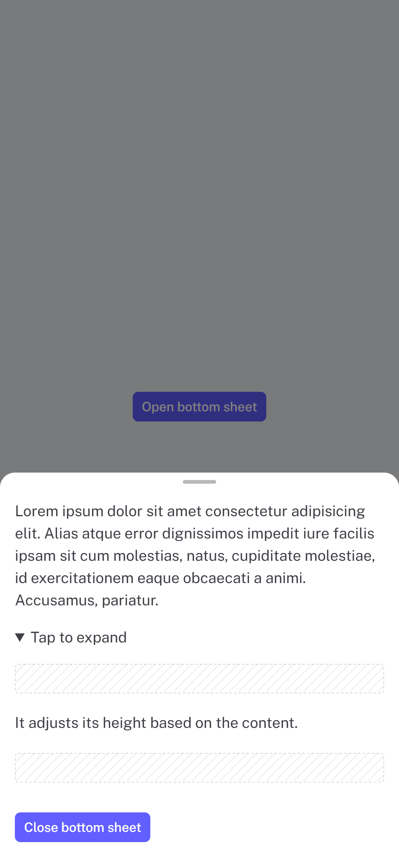 |
 |
 |
 |
|---|
Installation
npm install @douxcode/vue-spring-bottom-sheet
bun install @douxcode/vue-spring-bottom-sheet
Getting started
Basic usage
<script setup>
import BottomSheet from '@douxcode/vue-spring-bottom-sheet'
import '@douxcode/vue-spring-bottom-sheet/dist/style.css'
import { ref } from 'vue'

const bottomSheet = ref(null)

const open = () => {
  bottomSheet.value.open()
}

const close = () => {
  bottomSheet.value.close()
}
</script>

<template>
  <BottomSheet ref="bottomSheet"> Your awesome content </BottomSheet>
</template>
Basic usage setup + TS
<script setup lang="ts">
import BottomSheet from '@douxcode/vue-spring-bottom-sheet'
import '@douxcode/vue-spring-bottom-sheet/dist/style.css'
import { ref } from 'vue'

const bottomSheet = ref<InstanceType<typeof BottomSheet>>()

/* For vue 3.5+ you can use useTemplateRef() */
const bottomSheet = useTemplateRef('bottomSheet')

const open = () => {
  bottomSheet.value.open()
}

const close = () => {
  bottomSheet.value.close()
}
</script>

<template>
  <BottomSheet ref="bottomSheet"> Your content </BottomSheet>
</template>
Usage with v-model
<script setup lang="ts">
import { ref } from 'vue'

import BottomSheet from '@douxcode/vue-spring-bottom-sheet'
import '@douxcode/vue-spring-bottom-sheet/dist/style.css'

const sheet = ref(false)
</script>

<template>
  <button type="button" @click="sheet = true">Open bottom sheet</button>
  <BottomSheet v-model="sheet"> Your content </BottomSheet>
</template>
Usage in Nuxt 3
For Nuxt 3, just wrap component in <ClientOnly>
<template>
  <ClientOnly>
    <BottomSheet ref="bottomSheet"> Your awesome content </BottomSheet>
  </ClientOnly>
</template>
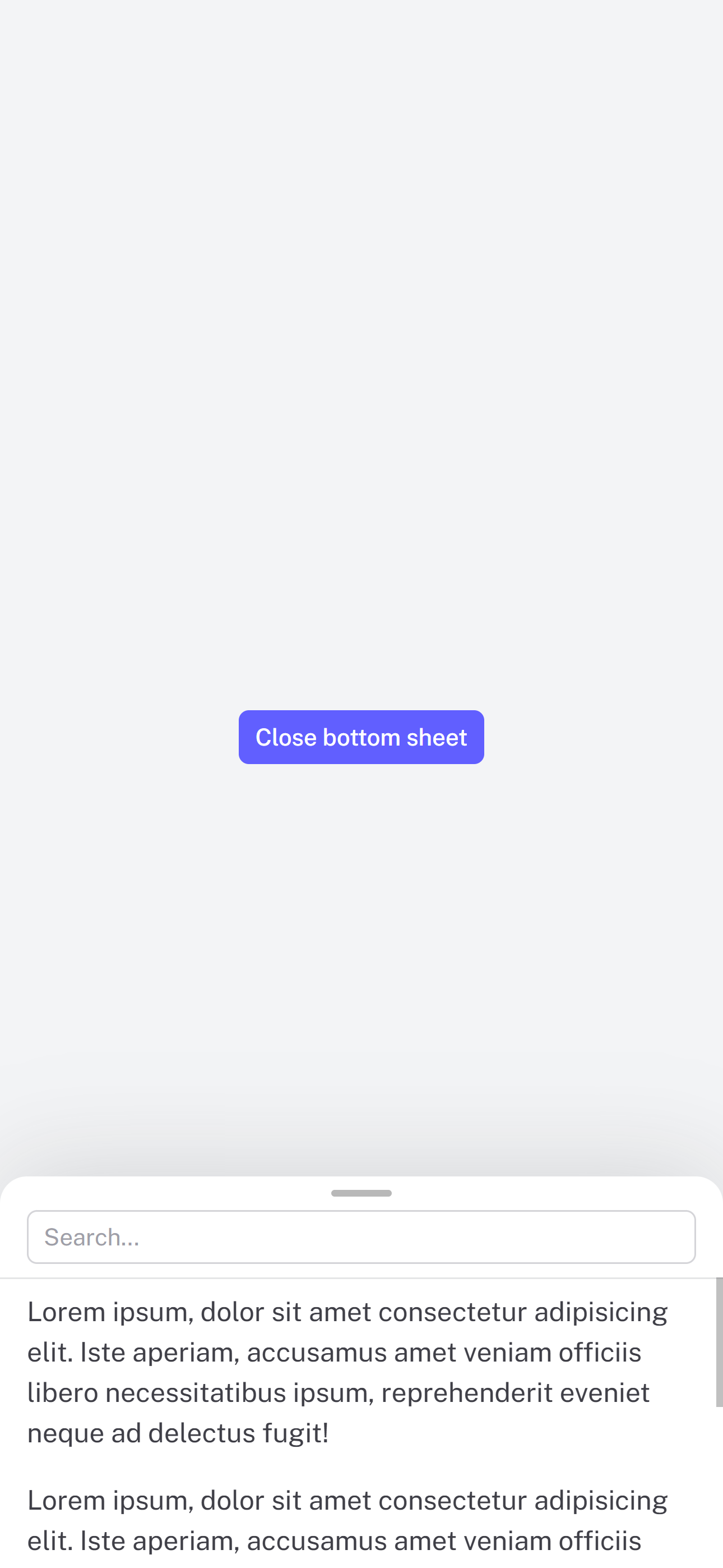
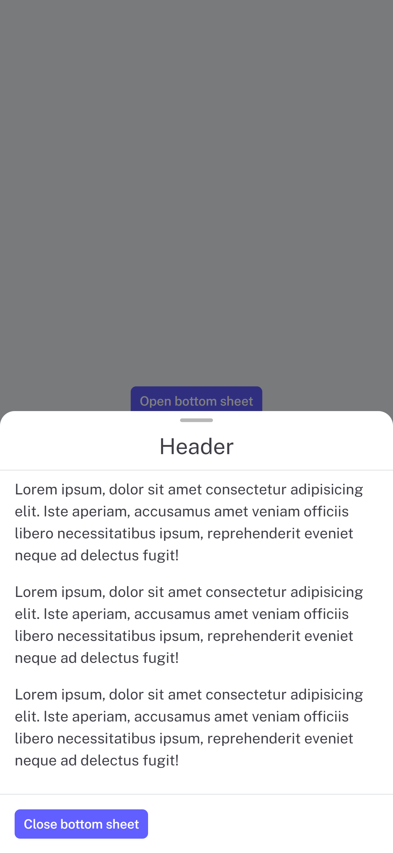
Slots
<template>
  <BottomSheet ref="bottomSheet">
    <template #header> Header </template>
    <div>Your content</div>
    <template #footer> Footer </template>
  </BottomSheet>
</template>
CSS Custom Properties
--vsbs-backdrop-bg: rgba(0, 0, 0, 0.5);
--vsbs-shadow-color: rgba(89, 89, 89, 0.2);
--vsbs-background: #fff;
--vsbs-border-radius: 16px;
--vsbs-outer-border-color: transparent;
--vsbs-max-width: 640px;
--vsbs-border-color: rgba(46, 59, 66, 0.125);
--vsbs-padding-x: 16px;
--vsbs-handle-background: rgba(0, 0, 0, 0.28);
Props
Prop Definitions
| Prop | Type | Default | Description |
|---|---|---|---|
| duration | Number | 250 | Animation duration in milliseconds |
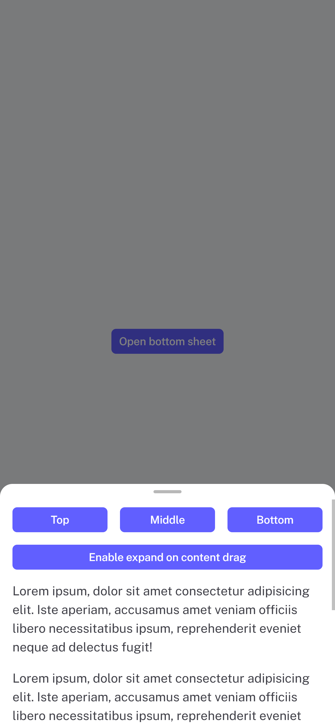
| snapPoints | Array<number|string> | [instinctHeight] | Custom snapping positions |
| initialSnapPoint | Number | minHeight | Initial snap point index |
| blocking | Boolean | true | Block interactions with underlying content |
| canSwipeClose | Boolean | true | Enable swipe-to-close gesture |
| canBackdropClose | Boolean | true | Allow closing by tapping backdrop |
| expandOnContentDrag | Boolean | true | Enable expanding by dragging content |
| teleprtTo | String | RendererElement | body | Teleport to a specific element |
| teleportDefer | Boolean | false | Defer teleporting until opened (Vue 3.5+ only) |
| headerClass | String | ‘’ | Set header element class |
| contentClass | String | ‘’ | Set content element class |
| footerClass | String | ‘’ | Set footer element class |
Exposed methods
Assuming there is const bottomSheet = ref()
| Method | Description | Example |
|---|---|---|
| open | Opens the bottom sheet | bottomSheet.value.open() |
| close | Closes the bottom sheet | bottomSheet.value.close() |
| snapToPoint | Snaps to an index of snapPoints | bottomSheet.value.snapToPoint(1) |
Events
| Event | Description | Payload |
|---|---|---|
| opened | Emitted when sheet finishes opening | - |
| opening-started | Emitted when sheet starts opening | - |
| closed | Emitted when sheet finishes closing | - |
| closing-started | Emitted when sheet starts closing | - |
| dragging-up | Emitted when user drags sheet upward | - |
| dragging-down | Emitted when user drags sheet downward | - |
| instinctHeight | Emitted when content height changes | height (number) |
| snapped | Emitted when sheet finishes snapping | snapPointIndex (number) |
Acknowledgments
This project was inspired by the following:
- react-spring-bottom-sheet: Accessible ♿️, Delightful ✨, & Fast 🚀
- @webzlodimir/vue-bottom-sheet: 🔥 A nice clean and touch-friendly bottom sheet component based on Vue.js and Hammer.js for Vue 3